
The Evolution of Hansea and the Story Behind Fish Burp
North Sea roots. Skate culture. Iconic graphics.
Hansea began on the North Norfolk coast, shaped by salt marshes, boatyards, old fishing boats and the cold light of the North Sea.
From the start, the aim was never to create conventional coastal clothing. We wanted something with more energy, more humour and more edge — clothing that felt connected to the coast without slipping into yacht-club styling or souvenir-shop nostalgia.
That meant looking beyond traditional maritime graphics and bringing together two very different influences: the working coastline of North Norfolk and the rebellious visual culture of 1980s skate, surf and punk design.
A brand born on the North Norfolk coast
Hansea is rooted in a landscape that is both beautiful and practical.
The North Norfolk coast is shaped by weather, tide and work. Boats are repaired in old yards. Creeks fill and empty. Salt gets into everything. Winter light turns the marshes steel-grey, while summer brings colour, movement and crowds back to the water.
That environment has always influenced the way Hansea looks and feels.
Our clothes are designed to be comfortable, useful and easy to wear, but the graphics are where the personality of the brand comes through. They borrow from maritime folklore, strange sea creatures, trading routes, old workwear badges and the rough visual language of skate culture.
The result is something deliberately difficult to place: part coastal clothing brand, part fictional trading company and part lost 1980s skate label.
The evolution of Hansea
Hansea started with a simple idea: make T-shirts we would genuinely want to wear.
The earliest designs were bold, colourful and slightly ridiculous. Fish, monsters, skeletons and nautical creatures appeared in distressed graphics inspired by old skate decks, surf posters, punk flyers and vintage screen-printed clothing.
Over time, the brand began to develop a broader identity.
The original graphic T-shirts were joined by heavyweight organic cotton styles, sweatshirts, hoodies, fleeces, jackets, beanies and workwear-inspired pieces. The designs became more varied too, ranging from loud illustrated graphics to understated chest logos and the fictional world of the Hanseatic Trading Company.
Despite that evolution, the central idea has stayed the same: make honest, distinctive clothing inspired by the North Sea, without taking ourselves too seriously.
The birth of Fish Burp
Every brand needs a graphic that seems to capture its personality almost by accident.
For Hansea, that graphic became Fish Burp.
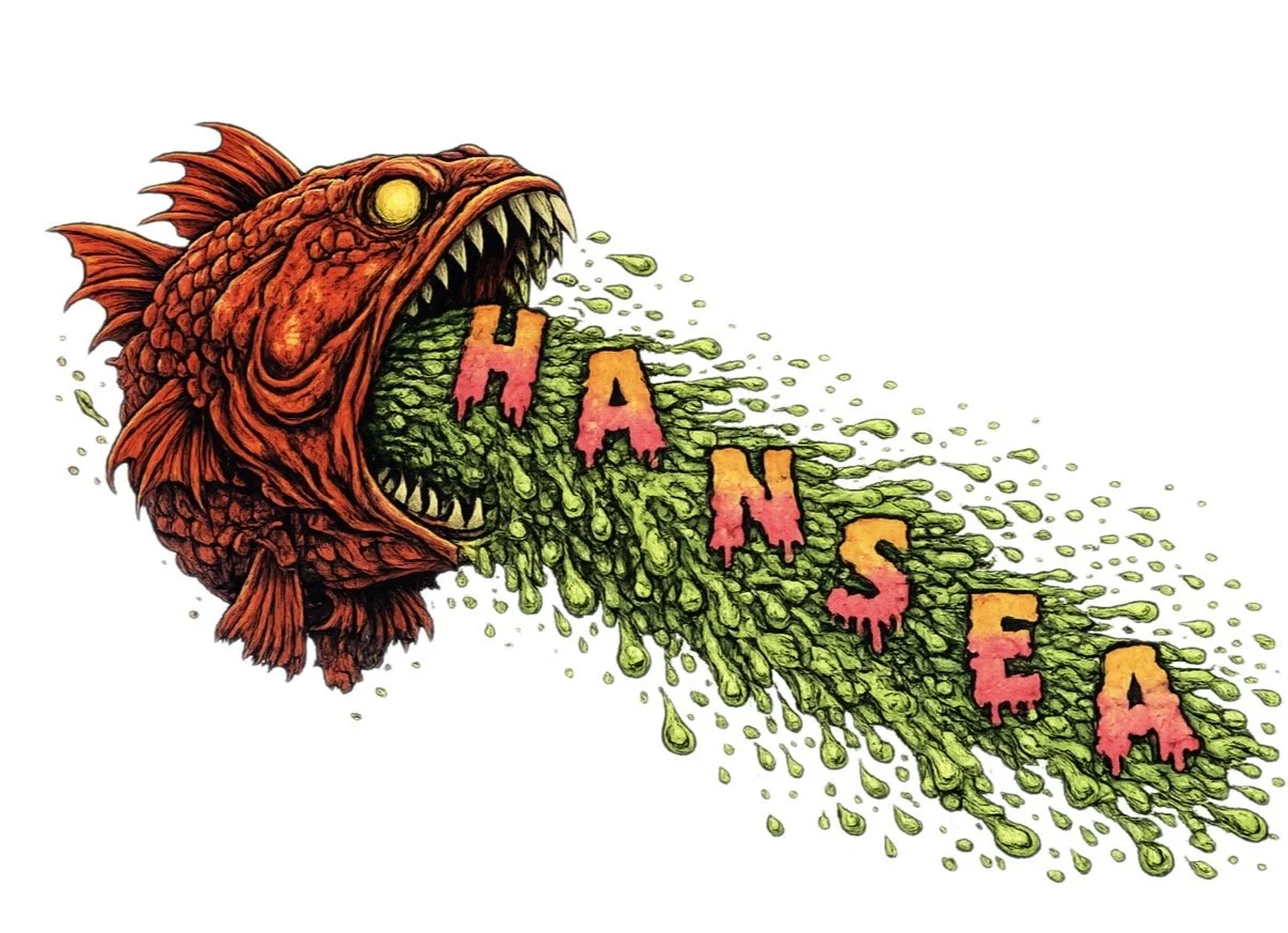
The design began as a rough, strange idea: a fish violently expelling a cloud of colour, with the letters of Hansea caught up in the spray.
Depending on how you look at it, the fish might be burping, coughing, sneezing or throwing up. That uncertainty is part of the appeal.
It is gross, funny and slightly chaotic, but it also has the energy of the old skate and surf graphics that inspired the brand. The fish is exaggerated, the colours are vivid and the whole image feels as though it is moving.
What started as a joke quickly became one of the most recognisable Hansea designs.
Why Fish Burp works
Fish Burp connects with people because it does not try too hard to be tasteful.
It is bold, playful and a little disgusting — in the best possible way.
There is also something very coastal about it. The sea is full of strange creatures, unpredictable weather, odd smells and things washing up where they should not. Fish Burp captures that less polished side of seaside life.
At the same time, it reflects the attitude behind Hansea: do not follow the crowd, do not make everything too serious and do not be afraid to create something simply because it makes you laugh.
The design has character, but it is still carefully drawn and composed. That balance between humour and considered design has become an important part of the brand.
Fish Burp and Fish Puke
As the design developed, it began to appear in slightly different forms.
Some people naturally called it Fish Burp, while others preferred Fish Puke. Both names stuck.
Rather than forcing a single explanation, we decided to let the graphic remain open to interpretation. The fish is expelling something; what exactly it is depends on the viewer.
That ambiguity has helped the design develop its own life. It feels less like a conventional logo and more like a character from the Hansea world.
More than a graphic
Fish Burp has appeared on T-shirts, sweatshirts and other pieces, but it represents more than a single product.
It marks an important stage in the evolution of Hansea — the moment when the brand’s humour, coastal roots and skate-inspired graphic style came together in one image.
It also showed us that the most memorable designs are not always the most serious or refined. Sometimes they are the ones that feel immediate, strange and impossible to ignore.
That idea continues to influence new Hansea graphics.
Whether the subject is a skeleton in a storm, a North Sea trading map, a monster, a workwear badge or a vomiting fish, the design should feel like it belongs to the same world.
From graphic tees to North Sea workwear
As Hansea has grown, we have also become increasingly interested in garments that feel practical and substantial.
That has led to heavier organic cotton T-shirts, sherpa fleeces, workwear-inspired jackets, hoodies and layers designed for cold coastal weather.
The louder graphics remain central to the brand, but they now sit alongside quieter pieces with small chest marks, embroidered logos and simple Hansea branding.
This mix allows the collection to move between two moods: bold illustrated clothing and understated North Sea workwear.
Fish Burp belongs firmly to the first.
Looking ahead
Hansea will continue to evolve through new colourways, new garments and new graphics, but the spirit behind Fish Burp will remain important.
We want the brand to stay original, humorous and rooted in the place it comes from.
That means continuing to take inspiration from North Norfolk, the North Sea, maritime history, coastal life and the visual energy of skate and surf culture.
Fish Burp may have started as a strange sketch, but it has become one of the clearest expressions of what Hansea is about.
Bold, coastal, slightly unruly and never too serious.
From the North Sea to the skatepark — and everywhere in between.
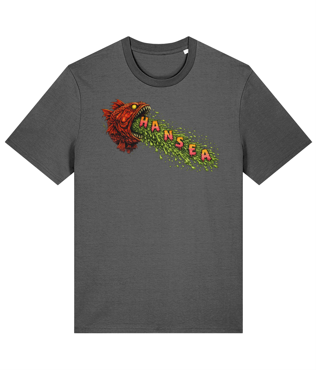
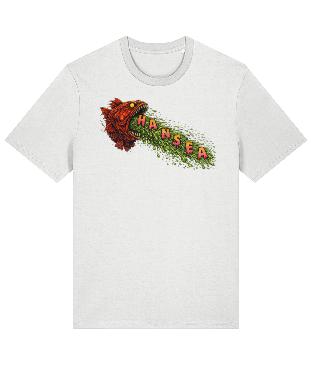
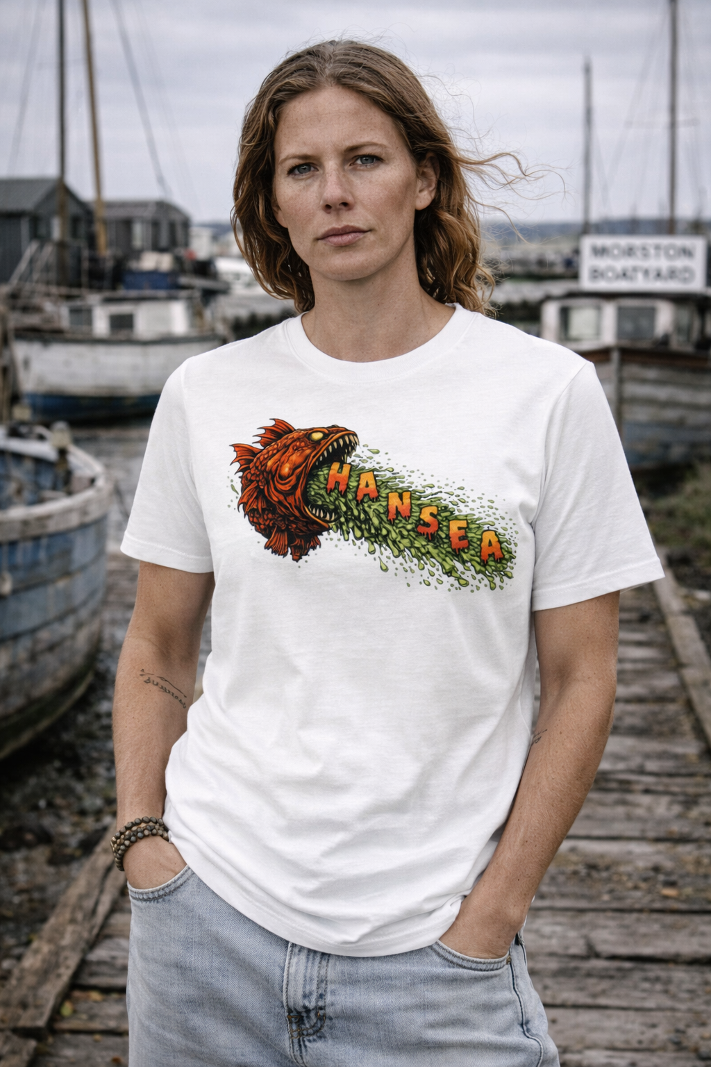
A grotesque North Sea vision in full flow. This tee features a furious red fish mid-retch, spewing the HANSEA name in toxic green slime across a churning sea. Loud, playful and unapologetically rough — it’s a nod to underground surf/skate graphics and the darker humour of coastal workwear culture.
Cut from soft but durable organic cotton, this is an everyday tee built to be worn hard, whether you’re harbour-side, seaside, or nowhere near the coast at all.
Details
100% organic ringspun combed cotton
Medium fit
Single jersey fabric
Set-in sleeves
1×1 ribbed neck collar
Self-fabric inside back neck tape
Wide double-needle topstitch at sleeve and hem
Fabric weight: 180 gsm
Easy to wear, built to last, and finished with a graphic that doesn’t behave itself.
